 Explore demo ↗
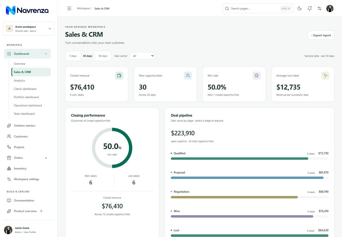
THE REVENUE WORKSPACE
Sales & CRM
Deal pipeline, owner filters, won revenue and follow-up priorities.
 Find your starting point
A beautifully connected starting point for your next admin app. Dashboards, customer workflows and reusable UI—in React and standalone HTML.
✓ Editable source✓ Separate edition guides
FROM AN IDEA TO A WORKSPACE
Start with a workflow that fits your product.
Explore the
screens. Make the source your own.
Bring customer records, orders and business reporting into a consistent workspace. Explore connected demo workflows before adding your own services.
Uses the edition selected in the demo gallery below.
01 — EXPLORE THE COLLECTION
Explore real pages from the template.
Choose your edition, then
take a look inside.
8 demos
Explore demo ↗
Deal pipeline, owner filters, won revenue and follow-up priorities.
 Explore demo ↗
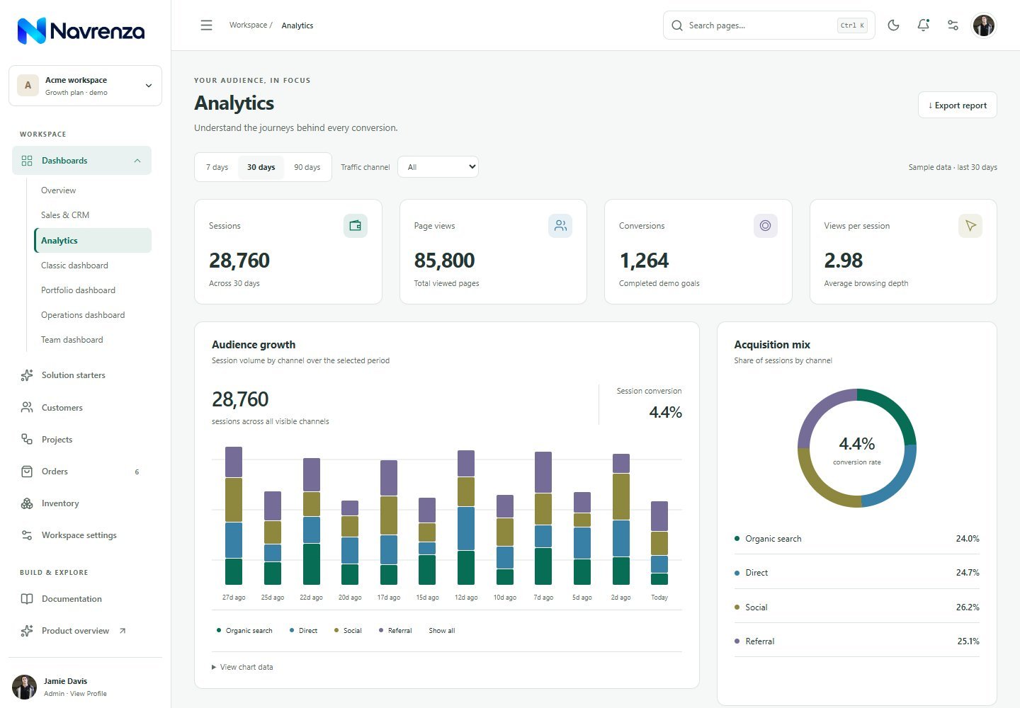
Traffic channels, conversion trends and landing page performance.
Explore demo ↗
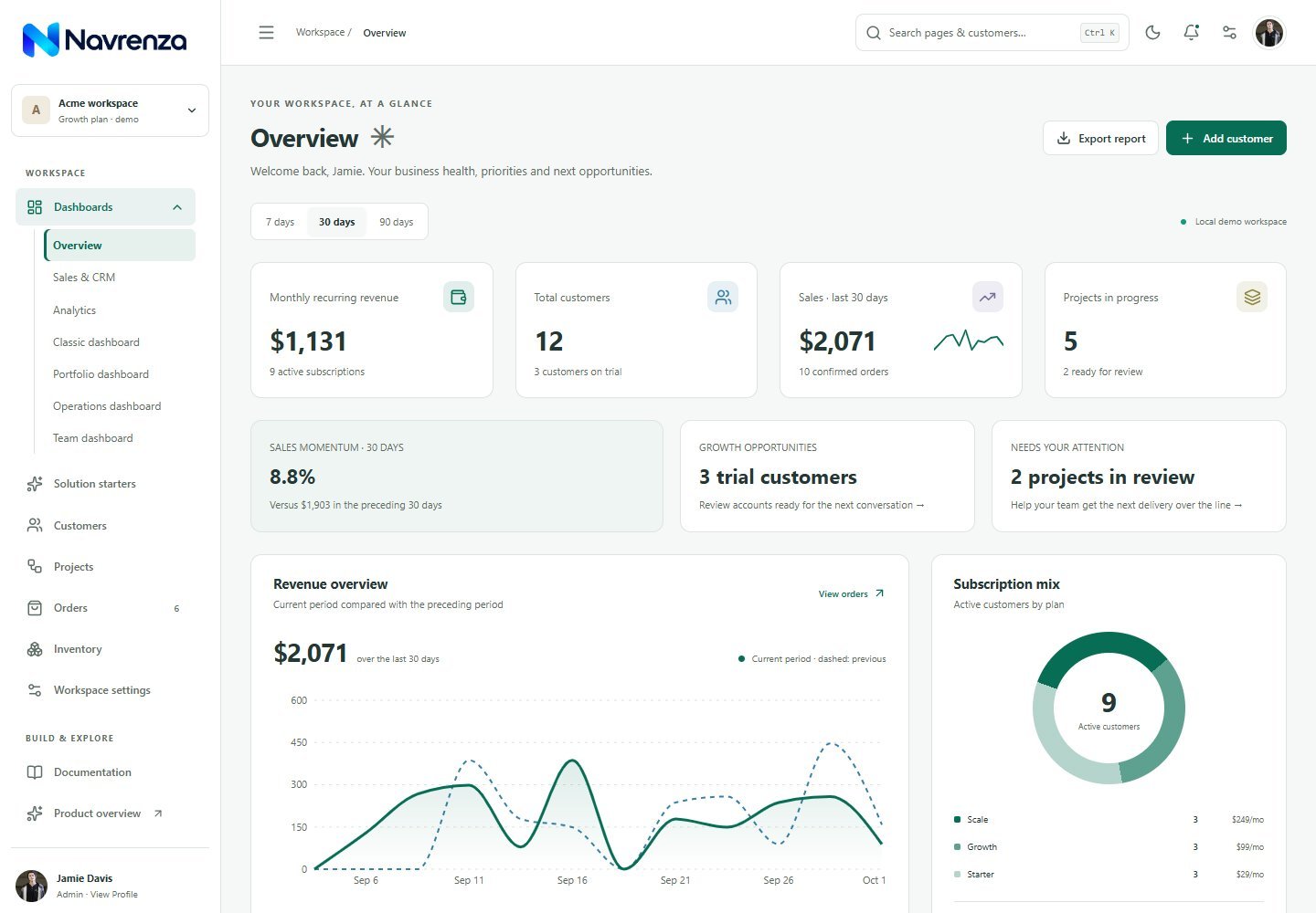
Revenue, customer activity and the metrics that matter.
Explore demo ↗
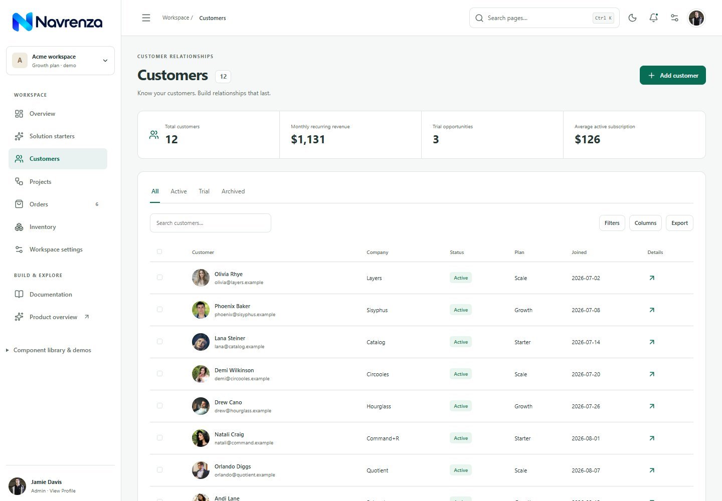
Search, filter and manage the people behind your business.
 Explore demo ↗
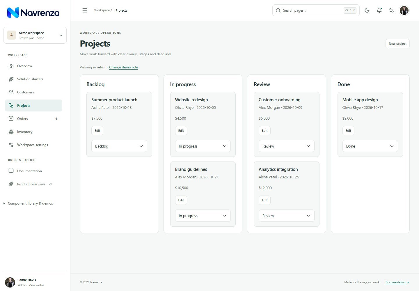
A visual workspace for priorities, progress and delivery.
 Explore demo ↗
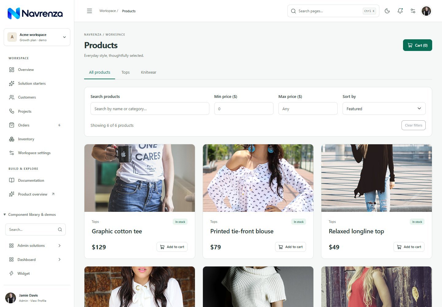
Browse a product catalog with useful filters and sorting.
 Explore demo ↗
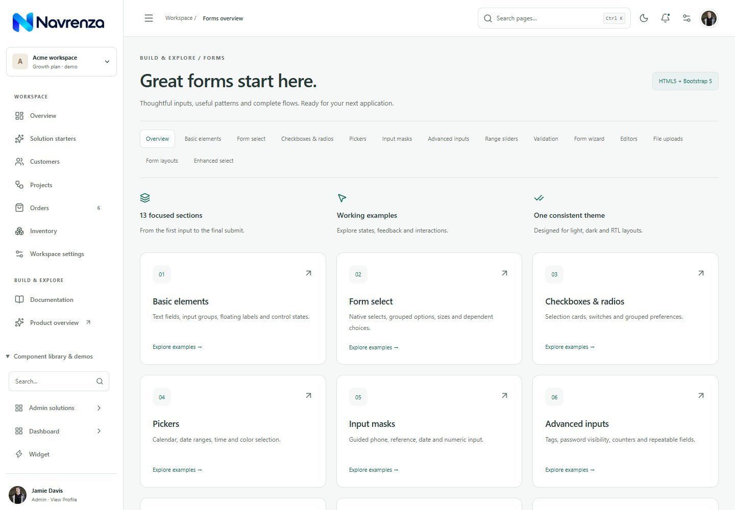
Start with inputs, validation, pickers and form layouts.
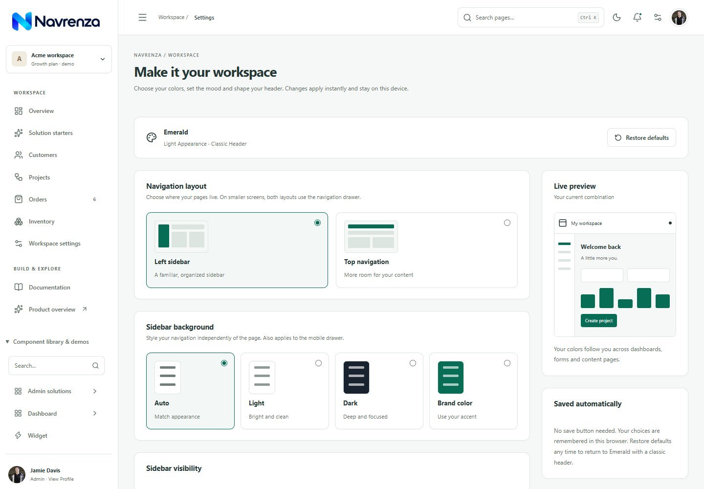 Explore demo ↗
Explore palettes, navigation layouts and appearance controls.
Previews show the HTML edition. Select React to explore the corresponding React pages.
02 — THE DESIGN LANGUAGE
A consistent foundation across pages, so you can focus on the product you want to build.
Ten coordinated palettes, light and dark modes, sidebar backgrounds and header styles. Preview them in the live appearance settings.
Vertical navigation, an icon rail or a horizontal menu. Responsive layouts keep your workspace usable on smaller screens.
Switch between left-to-right and right-to-left layouts with the same coordinated components and themes.
Searchable tables, column filters, forms, dialogs and browser demo workflows bring the interface to life.
Use React components or editable HTML, CSS and JavaScript. Connect the interface to your own backend and services.
03 — CHOOSE YOUR STACK
Separate source folders. Clear starting points.
For component-driven applications and custom product experiences.
For direct editing and integration with your preferred server stack.
Component-based workflows with utility styling and shared design tokens.
Standalone pages with Tailwind styling and native JavaScript workflows.
All four are frontend templates. Authentication, payments and other backend services are yours to connect. Demo records are sample data.
DESIGNED TO BE USED, NOT JUST PREVIEWED
Start with the source edition you need. Keep the UI, bring your brand and connect your own services.
React + TypeScript or standalone HTML. Separate folders, separate documentation.
Adjust colors, navigation and reusable components. Begin with a full demo or a starter page.
React’s connected modules include local JSON and a fake API. Replace the demo service with your own backend.
Illustrative package map. No production backend included.
Explore the documentationGUIDES FOR YOUR EDITION
Dedicated instructions, examples and backend guides for each edition.
Installation, typed components, routes, local JSON fake API and connecting your own backend.
Open React Documentation ↗Direct-file setup, native scripts, themes, page editing, mock API and PHP/ASP.NET integration.
Open HTML Documentation ↗Installation, utility styles, theme tokens, routing and your own API connection.
Open Tailwind React guide ↗Standalone hosting, Tailwind source, native workflows and server integration.
Open Tailwind HTML guide ↗React and standalone HTML editions, page examples, shared theme styles, local image assets, reusable UI patterns and documentation. Explore the demos to see the available screens.
Yes. The HTML edition contains normal HTML, CSS and JavaScript. Move the shared header and navigation into your server-side layouts and replace demo data with your backend.
No. Interactive workflows run with browser demo data. Connect your own authentication, database, email, payments and API services before using them in production.
Yes. Appearance settings include ten palettes, light and dark modes, RTL direction, sidebar styles and navigation layouts. The included style sources let you customize further.
No build step is required to host the HTML pages. You can preview layouts by opening a file directly; localhost or HTTPS is recommended for consistent browser storage and clipboard behavior. The React edition uses a Node-based development and build workflow.
YOUR NEXT CHAPTER STARTS HERE